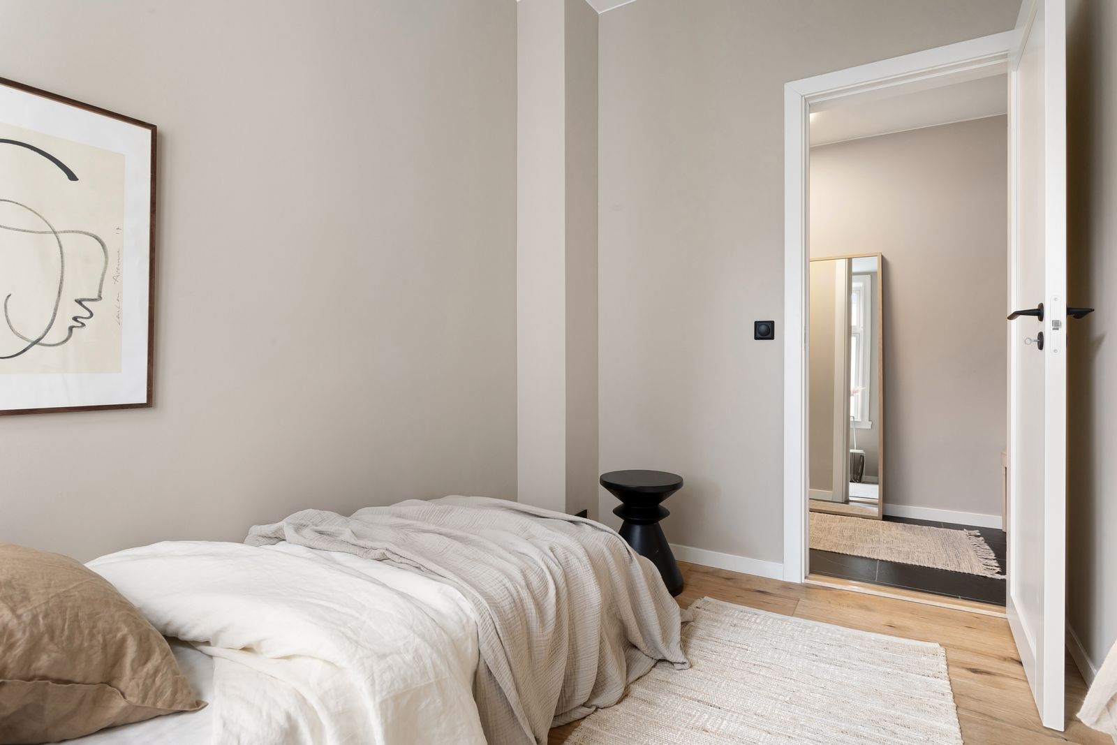
For about ten years, grey was the safe answer to every decorating question. Grey walls, grey sofa, grey floor, grey everything. It was never wrong — but it was never warm either, and in 2026 people are finally, decisively done with it.
The replacement is a whole family of warm, earthy tones: terracotta, clay, rust, caramel, mushroom, and browns from soft oat all the way to deep chocolate. This isn't a subtle shift. Walk through any furniture showroom right now and the grey is genuinely disappearing.
Here's how to actually use these colours at home — without ending up with a room that feels dark, muddy, or like a themed restaurant.
Why grey lost
Grey promised to be a warm-free neutral that went with anything. The problem is that "goes with anything" and "makes a room feel like home" are two very different goals. Cool greys reflect a slightly clinical, blue-ish light back at you, and a whole room of them reads flat.
Earthy tones do the opposite. They absorb light and give back warmth, so the room feels calmer and more grounded — especially in the evening, and especially in a north-facing space that never gets direct sun.
Start with the walls — but go warmer than feels safe
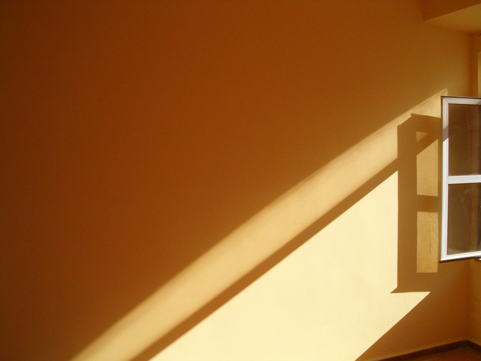
The single highest-impact move is paint, and the most common mistake is being too timid with it. A warm colour that looks bold on the little swatch almost always reads as a soft, comfortable neutral once it's on all four walls in real light. Whatever terracotta or clay tone you're eyeing, you can usually go one step deeper than your nerve suggests.
The swatch always looks bolder than the room. Nearly everyone paints a shade too pale and wishes they'd gone deeper.
If a whole room feels like too much of a commitment, paint one wall — ideally the one behind your bed or sofa — and let it anchor the space.
Keep the expensive stuff neutral, layer the colour on top
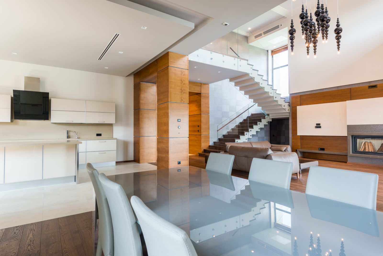
Here's the rule that keeps an earthy palette from dating: put your warm neutrals on the things that are expensive and permanent, and your actual colour on the things that are cheap and swappable.
- Permanent and warm-neutral: floors, worktops, big upholstered sofas, built-in cabinetry. Oat, sand, warm greige, honey oak.
- Swappable and colourful: cushions, throws, rugs, curtains, art, a painted wall, ceramics. This is where the terracotta and rust live.
Do it this way and when the trend eventually shifts, you're changing a few cushions and a rug — not replacing a sofa.
Layer tones, don't match them
The rooms that get earthy colour wrong usually got it matchy — one terracotta, repeated identically on the wall, the sofa and the rug. The rooms that get it right layer several related warm tones together: a clay wall, a caramel throw, a rust cushion, a chocolate-brown leather chair, raw oak. All in the same family, none of them identical.
Don't forget the greenery and the metals
Two small things pull the whole warm palette together. First, plants — the green of foliage is the natural complement to terracotta and clay, which is exactly why the two have always looked right together in nature. Second, swap cold chrome and nickel fittings for warm brass, bronze or aged gold. It's a small change that makes everything around it read warmer.
The one warning
Earthy doesn't mean dark. It's easy to layer so many deep browns and rusts that a room with modest light ends up feeling like a cave. If your space doesn't get much sun, keep the walls and big surfaces in the lighter warm neutrals — oat, sand, soft clay — and save the deep chocolates and oxbloods for accents. Warmth should make a room feel cosy, not closed-in.
See it before you paint
Paint is the cheapest thing in this whole article and the most annoying to undo. A terracotta that glows in a sunny showroom can turn flat and brownish in a north-facing bedroom — the colour genuinely changes with the light in your room.
Before you commit a whole wall, it's worth seeing the tone in your own space first — and once your palette is set, check that the furniture you're eyeing actually fits it and the room. You can do both, free, in RoomTourAI.
Photography via Pexels: Lisa Anna, drmakete lab, Max Vakhtbovych.